Historical article . References to tools and versions reflect the time of publication.
What will be in fashion, and what are the major web trends?
Three important questions for three different groups of people: website owners , their designers and developers .
In a constantly changing environment such as the Internet, it is important to stay one step ahead of the competition. By knowing the upcoming developments and trends in website creation, you will be able to shape your own websites and your clients' sites to align with the latest web trends.
In this article, we will present design and technology trends likely to dominate website design in the coming year.
Many of the trends below are continuations or slight modifications of developments from previous years. However, all of them will influence how we create and shape our websites over the coming year.
A truly mobile-first approach
Although mobile-first has been a website design trend for years, significant advances have only been made in the past two years.
We now officially have more mobile devices than desktop computers. This shows how important a role mobile will play everywhere. Mobile devices have become an important, and for many people the primary, tool for navigating websites.
Google plans to develop its first mobile-first index, giving greater importance and more favourable treatment to websites that consider their appearance on mobile devices more than on desktop computers. For this reason, mobile design is no longer something to be added as part of the web design process; it should be considered one of the first things to do.
In short, responsive design has matured. This is also evident from the fact that several mobile design elements have moved into desktop designs: large typography, hamburger menus, 'above the fold' content and more.
These trends will continue into the new year, with many more to come. One example is sticky elements at the bottom of a website: yes, that is not a typo, at the BOTTOM. Mobile phone users are becoming increasingly accustomed to them, as they are easier to use. Our own prediction is that we will soon start seeing them in designs everywhere.
AMP (Accelerated Mobile Pages) support is almost a trend category in its own right, and its use is expected to grow further in the new year.
Push notifications
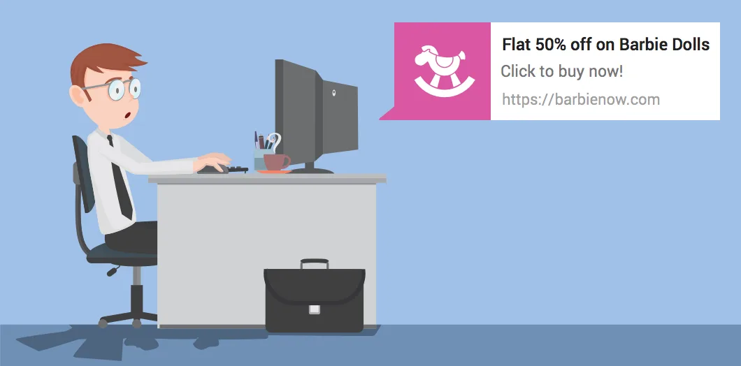
Push notifications are one of the most promising marketing channels. This year, we will see more and more websites offering to keep their users informed in this way.
You may wonder why you should add push notifications to your WordPress website. Because:
- They have good device and browser support
- They work brilliantly on mobile devices
- They have a higher click-through rate than email marketing campaigns
On the other hand, they can become annoying. In fact, simply asking permission to send push notifications is enough to be the main reason many users reject them. This will also be the main challenge for web designers. As push notifications become mainstream, a smart and appealing way must be found to incorporate this prompt into their designs.
Custom graphics and illustrations
Visuals = the core component of content on the Internet.
They engage people and can convey information that words and text cannot naturally communicate. In addition, images now have SEO value too, if properly optimised.
Although stock photos still work, a new trend is pulling websites in the opposite direction. Instead of generic stock images and graphics, prepare for 'handmade material'. Unique graphics based on each website's needs and original illustrations are among the web design trends for the new year.
Their advantages are a distinctive personality and tone that allow your website to stand out in a continually growing environment. Illustrations are also usually lighter than photos and other images. Combined with SVG graphics, they help meet the enormous need to increase website speed.
Animated graphics
More advanced browser technologies allow web designers to move away from static visuals and bring movement into a website's life. Website animation has become readily available!
Using it can breathe life into websites with dated designs. Especially when combined with microinteractions, it results in a more distinctive and interactive user experience.
Possible applications and types of animations:
- Logos• Animated images make logos unforgettable. Users recognise not just the logo, but also how it is presented. A logo can tell a story about the brand on its own.
- Animations loading• Loading animations are essential functional features. They bridge the wait before accessing the actual website and receiving information. They help prevent users from becoming bored and leaving your website before it loads.
- Navigation• Thanks to mobile devices, we are moving away from classic navigation menus. Hidden menus are in fashion.
- Hover effects• Mouse effects communicate the possibility of interacting with certain elements. They show users where they can take action and increase the likelihood of action.
- Scrolling effects• Effects triggered during scroll, take place as users move down the page. They can create a complete narrative, or storytelling experience, rather than simply showing a static page that moves. They can also replace buttons and menus and educate users about products, as Apple does.
Particle backgrounds
In the coming year, we may see more animation in website backgrounds. Particle backgrounds address some of the problems created by background videos, such as their size.
Because they are built with JavaScript, they are fairly lightweight. This lets them introduce movement into a website's background and attract users' attention without undermining it.
Vibrant colour palettes and gradients
In the past, web design had to keep colour palettes within safe limits. However, thanks to ever-improving screens and the vibrant colours they can reproduce, everyone can now use thousands of colours on any website.
This is something web designers are taking advantage of.
The latest web design trend includes high contrast and vibrant, bold colours.
This also applies to gradients, which are returning to the spotlight!
Asymmetry and deliberate irregularities in design
Since a website can now be displayed anywhere, from large televisions to the smallest mobile phone screen, it no longer needs to be designed with a traditional grid. Consequently, asymmetric layouts are being used more and more,
and they are expected to gain even greater prominence in the coming year.
Although the traditional grid still dominates content-heavy websites, most design-focused websites try to stand out by using unprecedented designs.
Combining asymmetric design with parallax effects can create a multilayered experience with richer effects.
Bold fonts and large typography
Large, bold typography has become an increasingly popular design trend in recent years.
Thanks to the growing number of fonts offered free to the public and improvements in device capabilities, your websites can now make a difference by using truly large lettering. Combining it with plenty of empty space makes reading easy for users.
In addition, almost all browsers support TrueType / Open Type fonts in their latest versions, allowing companies to use their own fonts for their online presence without relying on specific, limited choices.
Web designers will take greater advantage of this in the coming year, especially when replacing images with text, something that has always been desirable but not feasible. Fonts are lightweight and scalable, so they allow
visual messages without forcing the user's browser to download large images, with all the consequences that entails: data usage, slow loading and so on.
Microinteractions
If you are unfamiliar with the term, microinteractions are small indications of reactions on websites, mainly social networking sites, and already exist on almost all social networks. They are usually accompanied by small animations.
Microinteractions allow users to interact with content in different ways, depending on how they feel about it.
Their advantages are:
- Visual feedback on user actions
- Interactivity without the need to refresh the page
- An optimal user experience
They are already one of the emerging web design trends for the new year. For example, Medium recently introduced the ability to 'clap' for articles you like.
There are also several WordPress plugins that let you do similar things. For example, Contact Form by WPForms lets you define text that replaces the existing text as soon as you click the submit button. Plugins such as Animate It! can also add animation effects to buttons.
Chatbots
Chatbots are undoubtedly on the rise. Following Facebook's official invitation to developers to start producing bots for their clients' Messenger accounts, the number of existing bots increased from 30,000 to 100,000 in one year.
The first chatbot plugins for WordPress are already available. They can answer questions and provide customer support, at least at a basic level.
Summary
Predicting website trends for any given year cannot be 100% accurate. We will only know which of the above will dominate the new year once it comes to an end.
However, that does not mean there is no value in thinking ahead.
For anyone who works with or owns websites, it is important to stay on top of developments.
Many of the things mentioned in this article are already visible to some extent today and will become even more so in the new year. We will also see some truly new things emerge that have not yet appeared on the scene.